
Colour is the fastest tool in most design vocabularies, and Japandi deliberately sets it aside, which raises the obvious question of what replaces it.
The Neutral Foundation
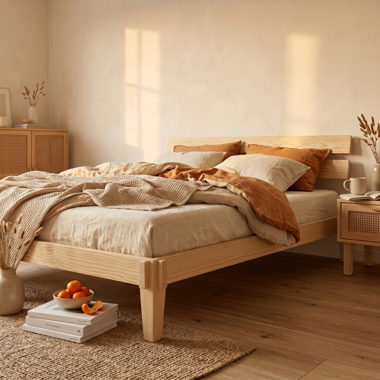
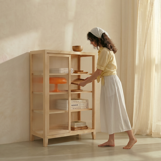
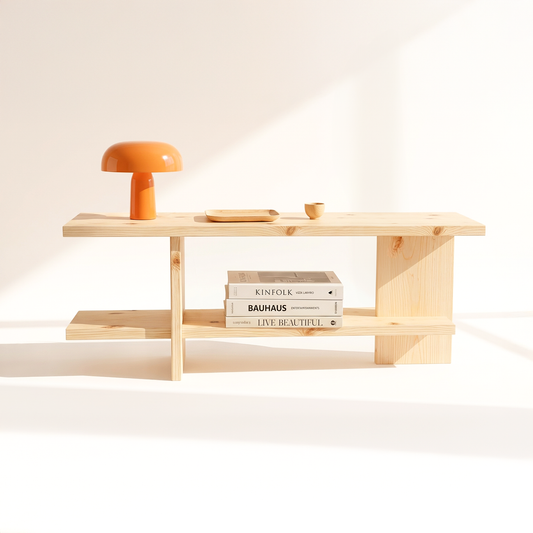
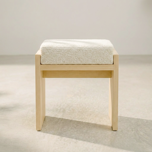
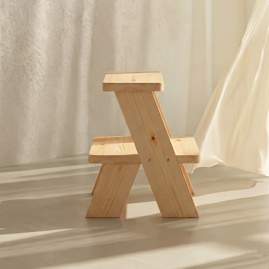
Pinewood tones, unbleached fabrics, and stone-like textures form a narrow, warm neutral palette. Pieces like the Tori Wall Hanger lean into this, letting material tone do the work colour usually would.
What Fills the Gap
Contrast comes from material and form instead, matte against grain, brass hardware against pale wood, a curved silhouette against straight lines. These distinctions are quieter than colour but no less deliberate.
The Honest Verdict
A Japandi room isn't colourless because it's unfinished, it's restrained on purpose, trading the immediacy of colour for the slower read of material and proportion. It asks more of the eye, and rewards a longer look.