
One of the most interesting design conversations of 2025 is the tension between vibrant colour schemes and neutral palettes. Both have passionate advocates — and both can create extraordinary homes. The question is: which is right for you?
The Case for Neutral Palettes
Neutral palettes — whites, warm off-whites, soft greys, beiges and the natural tones of wood and linen — are the foundation of Japandi, Scandinavian and Wabi-Sabi design. They create a sense of calm, make spaces feel larger and provide a timeless backdrop that doesn't date.
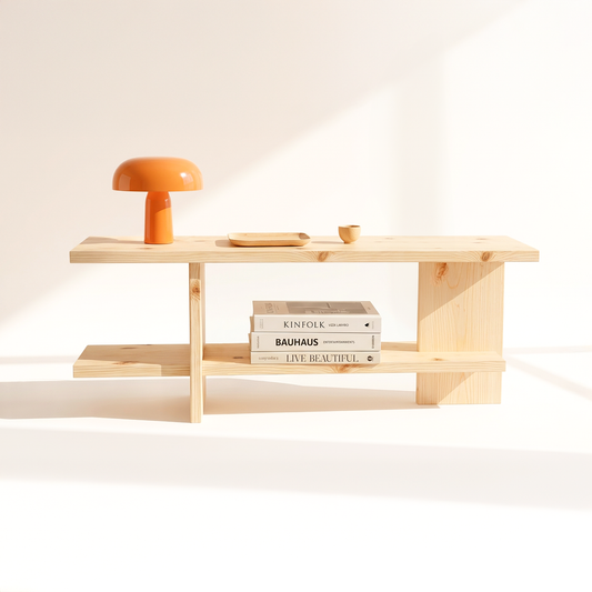
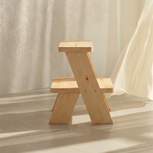
In Indian homes, neutral palettes work particularly well because they allow handcrafted furniture, natural textures and meaningful objects to take centre stage. A pale pinewood console against a warm white wall needs nothing else — the material does the work.
Neutral palettes also age gracefully. Unlike bold colours that can feel dated within a few years, neutrals remain relevant across decades and design trends.
The Case for Vibrant Colour Schemes
India has one of the world's richest colour traditions — from the saffron of Rajasthan to the indigo of Gujarat and the deep greens of Kerala. Vibrant colour in Indian interiors is not just aesthetic; it's cultural and emotional.
Bold colour works best as an accent rather than a base — a deep teal feature wall, a mustard sofa, a terracotta kitchen. Used with restraint, vibrant colour adds personality, energy and joy to a space.
The 2025 Answer: Warm Neutrals with Considered Accents
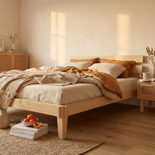
The most compelling Indian interiors of 2025 are neither purely neutral nor boldly vibrant. They use warm, earthy neutrals as a base — off-white walls, natural wood floors, linen textiles — and introduce colour through carefully chosen accents: a terracotta pot, a block-printed cushion, a brass lamp. This approach honours both the calm of Nordic design and the warmth of Indian tradition.
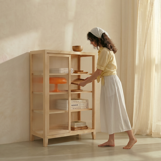
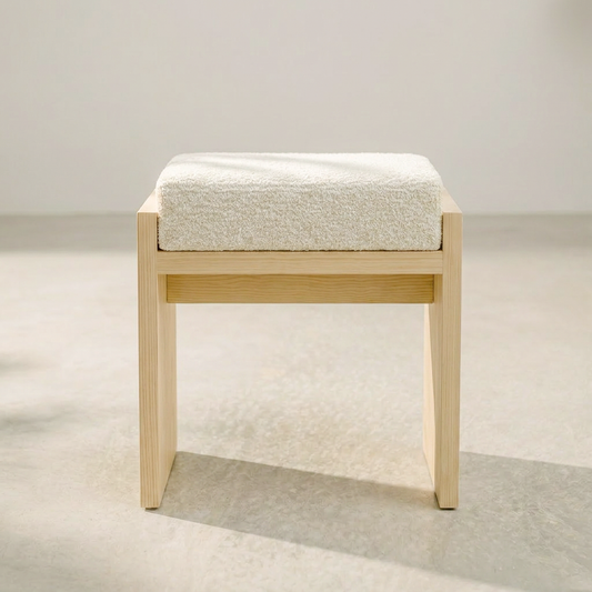
Handcrafted Japandi pinewood furniture — the natural anchor for any palette.
The pale, warm tone of Canadian pinewood works beautifully with both neutral and vibrant colour schemes. Shop all pinewood furniture →