
Colour in a home is usually discussed in terms of paint — the wall colour, the accent colour, the trim colour. But the most significant colour in most rooms is not on the walls. It is in the furniture. The colour of the wood in a room sets the warmth, the tone and the palette baseline against which every other colour decision is made. Choose the wrong wood colour and every other colour decision becomes harder. Choose the right one and the room builds itself.
The Wood Colour Spectrum
Wood furniture in Indian homes spans a wide colour range. At the dark end: walnut, wenge and dark-stained sheesham, which read as rich and dramatic but limit the palette to colours that can hold their own against a dark anchor. In the middle: natural sheesham and teak, which are warm brown tones that work with a wide range of palettes but can feel heavy in smaller rooms. At the light end: pinewood, ash and light oak, which are honey-to-cream tones that work with almost any palette and make rooms feel larger and airier than darker woods.
Why Pinewood's Tone Is the Most Versatile
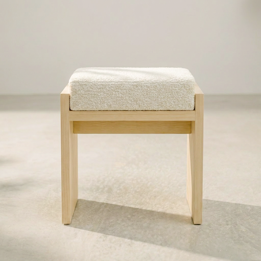
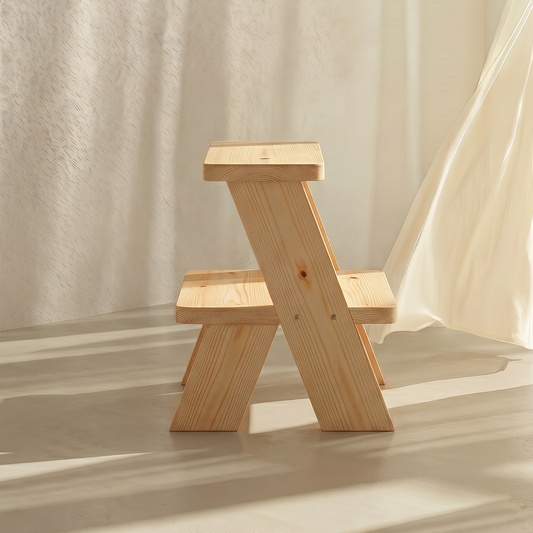
Pinewood's natural colour — a warm, light tone that sits between honey and cream — is the most versatile wood colour available for home furniture. It is warm enough to feel natural and inviting rather than cold and clinical. It is light enough to work with both warm and cool palettes without dominating either. And it is neutral enough to recede into the background when the room calls for it and come forward when the light catches it.
Against a warm white wall, pinewood reads as warm and natural. Against a stone or sand wall, it reads as a lighter version of the same palette. Against a terracotta or soft green wall, it reads as a natural complement. Against a cool grey wall, it provides the warmth that the grey lacks. There is almost no palette that pinewood fights with, which makes it the most forgiving wood colour for buyers who are not certain of their final palette direction.
The Patina Effect
Pinewood's colour is not static. With a matte oil finish, pinewood deepens gradually over time as the oil settles into the wood and the surface develops a patina. The honey tone of new pinewood becomes a richer, warmer amber over years of use. This deepening is consistent with the ageing of the other natural materials in the room — linen textiles soften and warm, stone surfaces develop a polish, cotton rugs develop a depth that new ones do not have.
A room furnished with pinewood and natural textiles ages in the same direction. Everything gets warmer, richer and more characterful together. This is the quality of a room built around natural materials — it improves with time rather than dating with it.
The Poka Bed: Pinewood as Palette
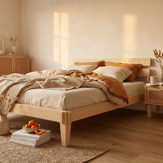
The Poka Bed by A Good Life is made from solid pinewood with a matte oil finish. The natural honey-to-cream tone of the pinewood sets the palette baseline for the bedroom. Warm white linen belongs. Sand and stone textiles belong. A terracotta lamp belongs. A cool grey duvet cover does not. The bed makes the palette decisions easier by establishing a clear warm neutral baseline that every other element is evaluated against.
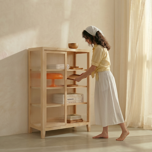
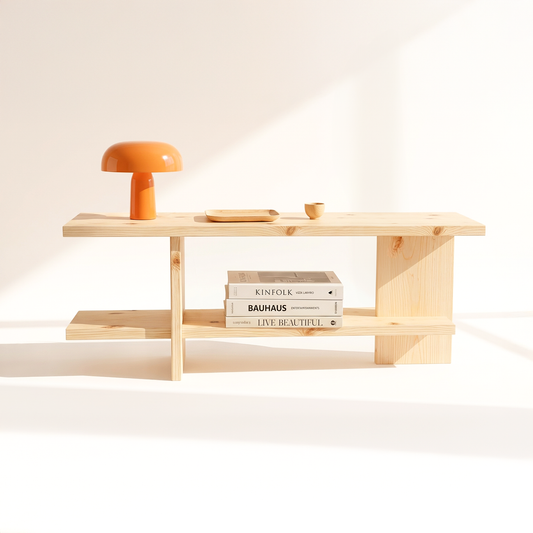
The Akari Pinewood Mirror, the Nagomi Console and the Kanso Fluted Cabinet are all made from the same solid pinewood. The colour is consistent throughout the home. The palette baseline is established in every room by the same material. The home speaks one colour language from the front door to the bedroom wall. This is the versatility of pinewood's natural tone — it works everywhere and it works consistently.
The Palette Decision Made Simple
If you are uncertain about your home's colour direction, start with pinewood. The warm, light, neutral tone of solid pinewood is the most forgiving palette baseline available. It works with warm palettes and cool ones, with bold accents and quiet ones, with natural textiles and with almost any wall colour. Build the palette around the wood rather than choosing the wood to match a palette you have already committed to. The wood is the palette. Everything else is a variation within it.