Scandinavian colour palettes — built on whites, soft greys, warm beiges and muted naturals — translate beautifully into Indian homes. When blended with India's own rich tradition of warm tones, handcrafted textiles and earthy accents, the result is a design aesthetic that is both globally inspired and deeply personal.
The Scandinavian Palette
Nordic interiors favour a restrained palette: crisp whites, warm off-whites, soft greys and the natural tones of wood and linen. These colours reflect light, create a sense of space and provide a calm, uncluttered backdrop for living.
The Indian Twist
India brings warmth, texture and soul to this palette. Think terracotta accents, brass hardware, block-printed cushions in muted indigo or ochre and handwoven jute rugs. These elements add depth and personality without disrupting the calm Nordic base.
How to Blend the Two
Start with a neutral base: White or warm off-white walls, light wood floors or neutral stone tiles create the Scandinavian foundation.
Add Indian warmth: Introduce terracotta pots, brass diyas, block-printed throws or a handwoven dhurrie in earthy tones.
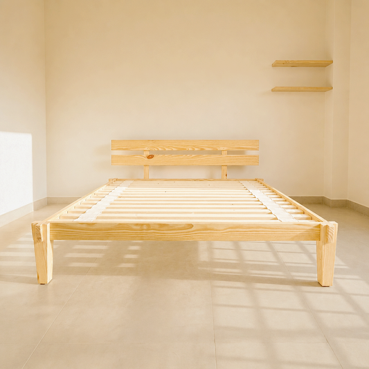
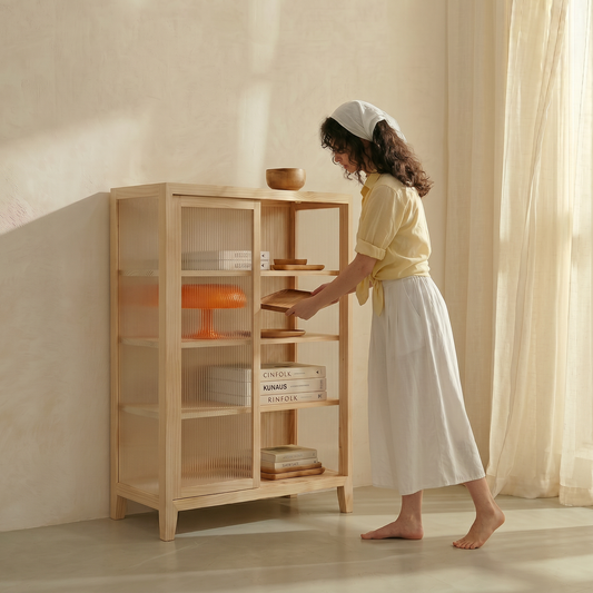
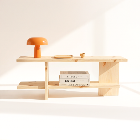
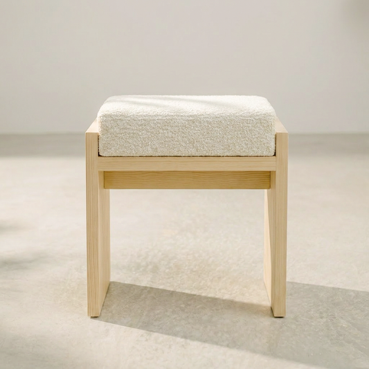
Use natural wood as the bridge: Canadian pinewood — with its pale, warm tone — sits perfectly between Nordic minimalism and Indian warmth. It's light enough to feel Scandinavian and warm enough to feel Indian.
Keep it curated: Lagom — just the right amount. Choose a few meaningful pieces rather than filling every surface.
Japandi pinewood furniture that bridges Nordic and Indian design.
The Kosho Bench and Nagomi Console from A Good Life bring the warmth of Canadian pinewood to any Scandinavian-inspired Indian interior. Shop all pinewood furniture →