Nordic colour palettes — built on whites, soft greys, warm pastels and the natural tones of wood and linen — are finding a natural home in Indian interiors. In a country where homes are increasingly becoming sanctuaries from the noise of urban life, the calm, light-filled quality of Nordic colours offers something deeply appealing.
The Nordic Palette: What It Is
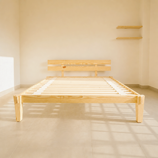
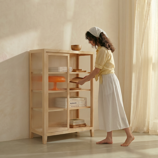
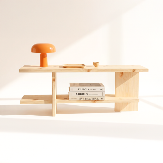
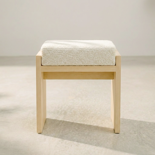
Nordic interiors favour a restrained, light-filled palette. Crisp whites and warm off-whites form the base. Soft greys, dusty blues and muted sage greens add depth without drama. The natural tones of wood — pale pine, warm birch, honey oak — bring warmth and texture. Accents are minimal: a single terracotta pot, a brass lamp, a dark charcoal cushion.
Why Nordic Colours Work in Indian Homes
They make spaces feel larger: Light, neutral tones reflect light and create a sense of openness — particularly valuable in compact urban apartments.
They create calm: In fast-paced Indian cities, a home with a Nordic palette feels like a genuine retreat — quiet, uncluttered and restorative.
They pair beautifully with Indian accents: The restraint of a Nordic palette makes Indian accents — brass, terracotta, block prints — stand out more beautifully than they would in a busier colour scheme.
They age well: Unlike bold or trendy colours that date quickly, Nordic tones are timeless. They work across seasons, styles and life stages.
How to Apply Nordic Colours in Your Indian Home
Start with white or warm off-white walls. Add light wood furniture in Canadian pine or birch. Layer with soft grey or dusty blue textiles. Introduce one or two Indian accents in terracotta, brass or ochre. Keep surfaces clear and let the palette breathe.
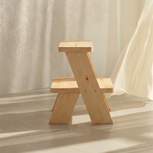
Canadian pinewood — the natural anchor of a Nordic palette.
The pale, warm tone of Canadian pinewood is the perfect natural anchor for a Nordic-inspired Indian interior. Every A Good Life piece is handcrafted from solid Canadian pinewood with a natural matte finish. Shop all pinewood furniture →